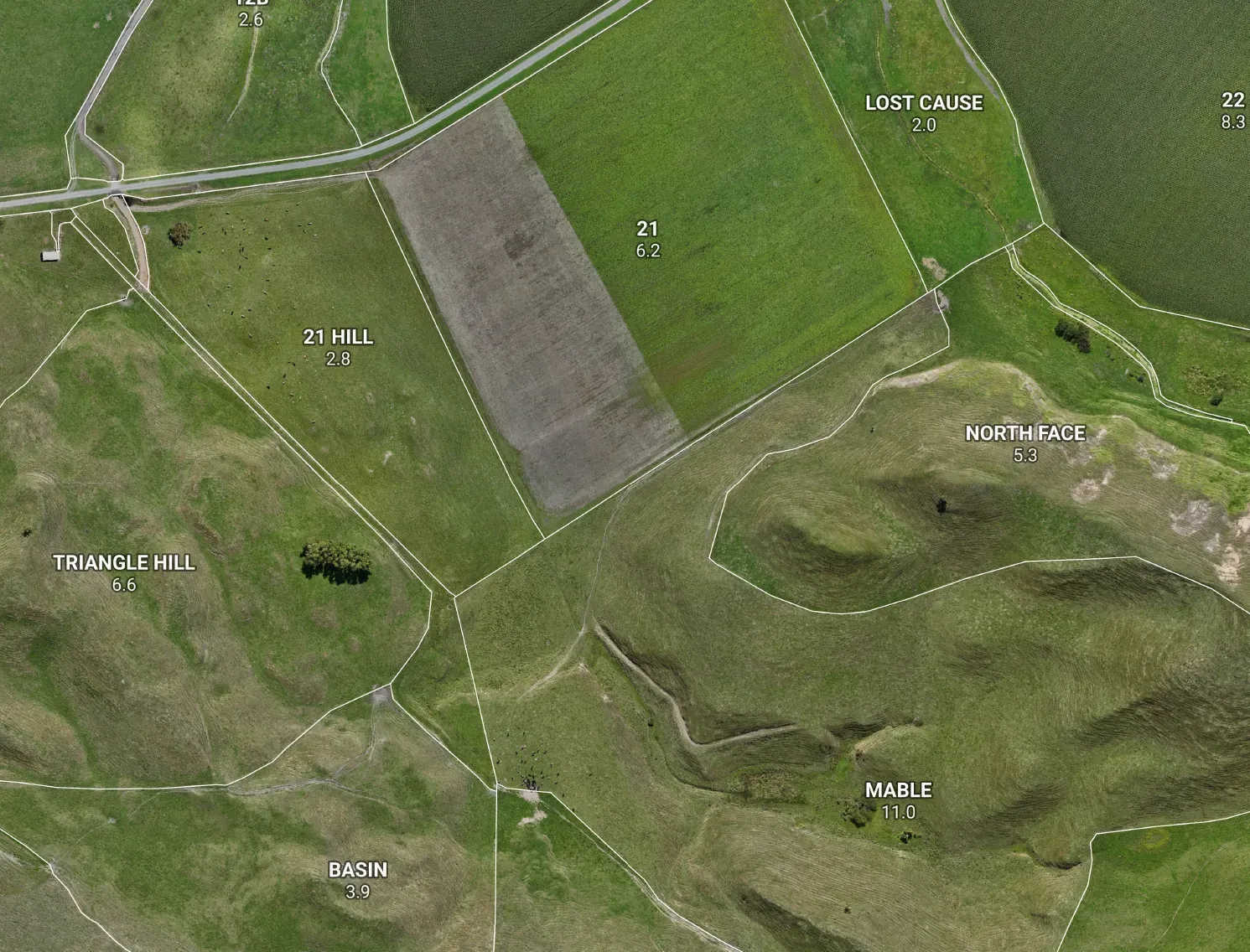



You draw your paddocks up carefully — over a nice clear aerial — then drop them onto a different map and the fence lines sit a metre or two off the actual fences. Annoying, and it makes you wonder which one is wrong. The honest answer is usually neither your drawing nor the maths — it’s the photo underneath. Worth understanding, because once you do, lining things up is easy.
Every aerial is pinned to the ground — with some error
A satellite or aerial photo isn’t just a picture; someone has to decide where on Earth each pixel sits. That pinning-down is never perfect, and different imagery does it to different standards.
Here’s the bit that trips people up. The big global imagery you see in a lot of mapping tools — the worldwide satellite layer — is stitched and aligned for the whole planet, not tuned to New Zealand. In NZ it commonly sits one to five metres off true ground position, and the wander isn’t even constant across a farm. LINZ aerial imagery is the opposite: it’s flown and corrected to the New Zealand survey network, so it’s the trustworthy reference for where things actually are in this country.
So if you trace your fences over a global satellite layer and then view them on accurate LINZ imagery, you’ll see a gap — every line shifted by roughly the same amount. Your lines are fine. They were just pinned to a photo that was itself a couple of metres out.
The fix is simple: trace over the same accurate imagery you’ll view on. Draw your paddocks straight over LINZ aerial (it’s free to add into the common GIS tools), and they’ll land where they should by construction. If you’ve already drawn everything over the wrong photo, you don’t have to start again — because the whole layer is shifted by about the same amount, it can usually be nudged back into place in one move.
And no — it’s not the coordinate conversion
People often blame the projection — the “convert from NZ coordinates to lat/long” step. It’s worth saying plainly: that conversion is essentially exact. New Zealand’s coordinates and the everyday map projection describe the same ground to the millimetre, and the conversion is a reversible piece of maths, not a guess. It introduces no visible shift. The wobble you’re seeing is the photograph, not the numbers.
The other gotcha: one farm, two photos
There’s a second thing that surprises people, and it’s not about your lines at all — it’s the imagery itself looking like two different photos stitched together across one farm. Darker on one side, a different green, an obvious hard edge running through the middle.
That’s exactly what it is. The national LINZ aerial is a mosaic — it’s quietly built from many separate flights, captured in different years and seasons, and it shows you the newest one available for each patch. Where two of those flights meet, you get a seam: different sun angle, different season, sometimes different sharpness. If your farm happens to straddle that join, the join runs right across your map. Nothing’s broken — it’s just two captures meeting.
The cure is to stop letting the map mix captures and instead pin one single survey for the farm. One flight, one season, one look — no seam. We’ve built this straight into the Maplands app: for a given farm we can lock the aerial to a single LINZ survey that actually covers it. The trade-off is honest — that one cohesive capture might be a little older or a touch coarser than the newest patch in the mix — but a clean, consistent photo reads far better on a farm map than a sharp line splitting your place in two.
How close is “close enough”?
This is where it pays to be straight about what a farm map is for.
For the everyday working map — paddock names, areas, the layout of races, troughs and gates — a metre or two doesn’t change the job. The paddocks are still the right paddocks, the areas still add up, the plan still works. Tracing over good imagery is a perfectly good draft of where your fences are.
What it is not is a legal boundary. If you’re dealing with a dispute, a subdivision, or anything where the exact line carries legal weight, that’s a licensed cadastral surveyor’s job, not a traced photo — no aerial, ours or anyone else’s, is a substitute. We’re clear about that line so you always know which side of it you’re on. It’s the same honesty we bring to farm-scale mapping generally: tell you what the map can carry, and what it can’t.
The clean fix: fly it
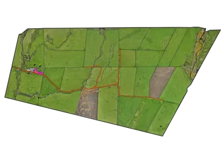
If you want imagery with no seam, no offset, and no guessing — fly the farm. A drone orthomosaic is a single flight stitched into one seamless photo, captured this season, and pinned to the New Zealand survey network so your lines actually sit on it. No mosaic join, because it’s one capture. No global-imagery drift, because it’s locked to the local network the same way LINZ is. And it’s sharp enough to mark fence posts off — the same flight that gives you the picture gives you a base your paddocks land on cleanly.
That’s the difference between borrowing whatever photo happens to be online and having one flown for your place. One is a good draft; the other is a farm map that looks as good as it measures. If you’re weighing it up, here’s why we fly farms in the first place.
So: if your traced lines don’t quite match the aerial, don’t bin the work. Check which photo you traced over, line your drawing up with accurate imagery — and when you want it properly seamless and current, that’s what the drone is for.